How to Tell How Exciting a Game Was – From Just In-Game Data

rooney west ham gif

ROOOOOOOONEY!

We all have our favourite sports, and our favourite sport moments that make the highlight reels.

However, what if you could judge how boring or exciting a game was, simply by analysing the in-play implied percentages for each team or outcome?

This is what is promised by a new site, Gambletron2000.com.

gambletron_man_utd_vs_b_munich

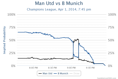
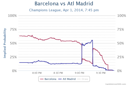
Here is the graph of the recent Champions League game between Man United and Bayern Munich. You can see how dramatic the betting market responds to a goal- the implied probability for a Man United win spikes sharply upwards when Vidic scored, then sharply back down when Bayern equalised. The game ends a 1-1 draw, as you can see the implied chance for either team scoring trended towards 0% as the 90 minutes approached. The fixture between Atletico Madrid and Barcelona finishing in a similar fashion:

gambletron_barcelona_vs_atl_madrid


There could be interesting opportunities for profit when analysing games like this.

Read the full article on how the “hotness” algorithm works (ranking the game for excitement) here.

Launch Codes: Automate Tasks, App Launches & More for Windows

There’s a very useful, lightweight and simple-to-use productivity utility for windows called AutoHotKey. I used it to create a simple script to save time for myself with repetitive tasks.

I call the file Launch Codes, as it both launches apps, and it is launched automatically when Windows logs in. I achieve this by saving the .ahk file in the following location:

C:\ProgramData\Microsoft\Windows\Start Menu\Programs\Startup

I’ve provided the Autohotkey script in Github so you can use it as a starting point to build your own custom scripts. Use it as you see fit, all of the tasks within are collated or modified from stuff in the Autohotkey help file (which you get when you download the AHK download bundle), or from the extremely helpful Autohotkey forum.

What tasks do I use it for?

  • Launching common apps, like Chrome and Notepad, with just two key presses.
  • Reducing my email address to three letters, which then expands to my full address. Very useful for repetitive logins!
  • Running a google search with Ctrl+C, Win+G. For example, I could highlight something in a PDF, and google it very quickly rather than pasting it into a browser tab.
  • As above, except it searches wikipedia directly instead of google.
  • Print entire screen to clipboard with three keystrokes.
  • Help message box for all of the above.

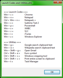
Here’s the help message box with full list of tasks:

AHK launch codes help dialog

Enjoy!

Use your Raspberry Pi as a Domain specfic VPN Router

This is a cool project I came across. 

You can use your raspberry pi to report your IP address as being in a different country, for a specific domain.

You could use it to use the US Netflix catalog from outside the US for example, not that I’d condone doing that! Or BBC iPlayer from outside the UK, Comedy Central from outside the US, evade the ridiculous Youtube restrictions in Germany and so on. 

https://github.com/dboyd13/DSVR

Multimedia & Business – Movie OS

Science Fiction is a big source of inspiration for new technology development. Some gadget that became or are becoming reality after first appearing in movies include jetpacks, invisbility cloaking, GPS and holograms.

Computer Operating Systems depicted in movies and TV shows are often pure fiction that is added in post-production by graphic designers. However, despite these ‘Movie OSs’ often being scoffed at online, some believed that these could become inspiration for how future OSs could become.

Some examples of Movie OSs.

The Matrix Reloaded:

Jurassic Park runs on UNIX:

Hacking into the Department of Defense in Swordfish:

Predator’s Wrist-Computer UI:

And of course the famous genture-based UI from Minority Report, which could well be in consumers homes within the decade:

CSI New York uses Visual Basic to code up GUIs (hilarious):

Further Reading

Multimedia & Business – Zeo – Data on Your Sleep

Zeo is an example of how technology is allowing people to monitor their own health. Zeo’s technology measures sleep patterns, and produces easy-to understand charts that allow the user to see clear information about their sleep.

Clearly, a person would not be able to make sense of the data were it not for the user-friendly graphics. More examples of similar products include Fitbit and DirectLife.

Using cheap electronic sensors, the internet and friendly multimedia graphics, medicine may chance from being doctor-patient focused to more self-diagnosed.

Four Principals of Graphic Design – Lifehacker.com Evaluation

This week, I am reviewing the very useful software and productivity-related site lifehacker.com under the 4 pricipals of graphic design.

Lifehacker logo

Proximity

“Proximity refers to the distance between elements on a Web page and how the elements relate to one another”.
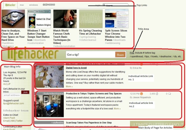
Lifehacker Homepage

By grouping related items together on the homepage, Lifehacker have managed to create a visually appealing page that uses the prinicipal of proximity well. Note the top links at the top of the page being grouped together, and note the individual articles being laid out after one another in logical fashion, with each article having a picture on the left, a description in the middle, and miscellaneous information on the right. A user can navigate through new articles every day in this consistent, logical page layout.

Alignment
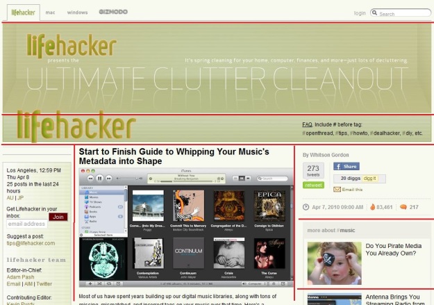
Lifehacker Alignment

As we can see here from this screenshot, Lifehacker does a good job of aligning the different elements on one of it’s articles webpages. The different elements of the page, outlines in red above, line up nicely creating a nice, pleasant layout for the reader. The images in the ‘related articles’  on the right are nicely lined up also. The one element of the page that is not lined upto anything is the search box on the top right, this is alingned to the extreme right, which is consistent with most web users expectation of where to look for a search box.


Repetition

“The principle of repetition states that you repeat some aspect of the design throughout the entire piece”.
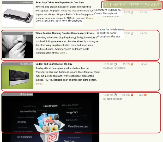
Lifehacker Repetition

As I’ve noted in the image above, some of the design elements that are kept consistent are the use of the dull green backround colour for highlighting white text in labels and titles, keeping the same sans-serif font throughout the whole website and keeping the article link layout the same for each article – note for example, the same timestamp, number of hits for the article and number of comments for the article are all in the same place and use the same logos in each article link. Again, I feel Lifehacker scores highly for consistency.

Contrast

“The principle of contrast states that if two items are not exactly the same, then make them different”.
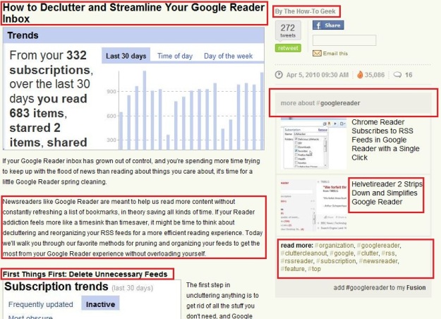
Lifehacker Contrast

To highlight one aspect of where contrast is used, I’ve highlighted the different types of text above. Things to note:

  1. The big, bold article title
  2. The smaller, bold subheading
  3. The smaller, unbold text for the article content.
  4. The grey-coloured text for the heading on the right hand side.
  5. The grey box which makes the “#googlereader” tag stand out and differnetiates it.
  6. The slightly bigger text in black for the related article description.
  7. The tag cloud uses green text to differentiate the tage from other text on the page.

For more on the four pricipals of graphic design, see this article on C.R.A.P.

Multimedia & Business – Infographics

Infographics are a a way to communicate the maximum amount of information possible using the smallest possible space,  and using as little text as possible.

A good example is the diagrammatic representation of the Luas stops in Dublin. Most information is left out, as the communicator only needs to know the number of stops, and in what order they are, rather than use the map to navigate.

A humorous infographic on Apple products:

Multimedia & Business – Training

terminator-augmented-vision-reality

Augmented Reality is an exciting new area in which multimedia is having an impact that will become increasingly important in the future. The first time the general public became aware of the concept of AR was in the Terminator movies. Arnold Schwarzenegger’s Terminator was a deadly effective killing machine as a result of the tactical information his field of vision provided him.

A slightly more benevolent use of AR in the future will be in the area of training. Currently, training can be a source of information overload. In the video below, the mechanic sees only the information needed at the exactly time he needs it, to conduct the repairs on the vehicle.

The US Military created the PC shooter “America’s Army” in 2002 to give a realistic simulation of what military training and combat is like. For more information on how the US military is adapting computer games for training and simulation purposes, see here.

Multimedia & Business – Reference

As I’ve said before, data visualisation is becoming increasingly important as the amount of data grows and grows, yet our ability to consume information hasn’t changed with perhaps thousands of years. To make sense of this information overflow, effective multimedia can be uitlised in creative new ways. A example is the iPad app above, Elements. It’s hailed as one of the best examples of how the new tablet device from Apple can be used. Elements allows a user to rotate an extremely high quality image , in three dimensions, of all the elements on the periodic table. Apparently the creator burned out six high-end cameras taking so many photographs for this task! The effect is amazing: